s
Hi everyone! Thank you for joining us this week for the SpiegleMom Scraps and Creative Embellishments Product Swap Blog Hop! What an awesome duo! Their products compliment each other beautifully, and it was such a blast combining fabulous products from both companies! I hope you enjoy the project I came up with! Be sure to leave a comment at each stop (including mine) along the way for YOUR chance to WIN a $25.00 gift card to SpiegelMom Scraps OR a $30 gift certificate to Creative Embellishments! That’s all you need to do in order to enter to win! 😀 You have a whole week to complete the hop (this hop is open until 11:59 pm ET on March 7th). Be sure to let your friends know too! The blog list is at the bottom of this post to guide you to your next stop. I hope you have fun checking out all the inspiration we have in store for you!
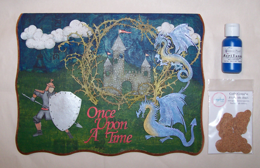
The first project I created has actually been planned for quite a while, so the base had already been prepared. I have a decorative wooden box that I’ve been meaning to alter for my daughter. It’s a sizable piece and the plan is to alter each side and the lid with a different fairy tale inspired scene. For the lid, which I removed to make it easier to alter, I decided to go with Sleeping Beauty since it requires the most space for what I have in mind. I started out by adhering patterned tissue paper to the flat surface. I then used the Blue My Top Shimmerz acrylic paint from the SMS store blended with a black acrylic I already had to create the sky, and green with black and yellow to variegate the grass portion of the background. I altered the Corky Cumulus die cuts from the SMS store using gesso and PITT markers:

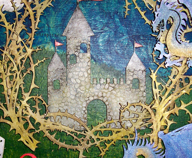
I lightly gessoed all the CE pieces for my project this time in order to have greater control over the final color on each piece. The Cobblestone Castle was altered using Distress Paint and PITT markers. For the Thorn Frame and Thorn Flourishes, I started out with a layer of Art Extravagance Clear Crackle Texture Paste, then used Distress Paints in a few different shades:
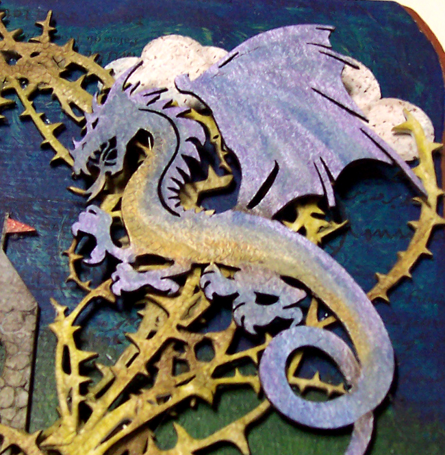
The Dragons were altered using some gorgeous, shimmery Viva Decor Inka Gold in multiple colors. Some were rubbed on dry, and others were applied with a wet brush, then blended. For the Once Upon a Time title piece, I used a PITT marker, then went over it with Inka Gold for some shimmer:
The Knight piece and shield are from CE’s Knight Set and was the most fun to alter! I loved drawing on the details rather than leaving as a silhouette. It has so much versatility and can be customized in so many different ways! For mine, I sued PITT markers, and watercolor pencils. I used an adirondack paint dabber on the shield, then rounded it out, and popped it up with some foam adhesive to add more dimension:

To tie elements together, I added the same red from the title piece to the castle and the belt/sash I drew onto the warrior. I finished the piece by using copper acrylic paint that matches the copper details on the character to the border/lip of the lid. Here’s how it turned out:

Once I’d completed my project, I realized I still had a ton of awesome SMS goodies that Jody had generously supplied, so I decided to create a tag set as well! For all 3, I started out by distressing the edges and inking with Distress Ink pads. The papers used were from a Tim Holtz paperpad, and the trims are either TH or G45 from my stash. The CE panel I cut apart and used on 2 of the tags is the Moroccan Lattice Panel (it’s a must have!!!), and the sentiments are all from the Small Sentiment Words Set (LOVE this one!). The background stamps I used are my faves and staples in my crafting arsenal. The 2 of the ends feature the Distressed Text stamp, the one in the middle uses the Distressed Grid stamp and the Distressed Corner stamp. The one on the right also uses the Distressed Chicken Wire Stamp. I splatter them using black india ink, white acrylic paint, and a green smooch spritz.

For the one on the left, I used Green Acres Sequins from the SMS shop, along with half of a white doily (Jody had packed my goodies in a glassine bag and sealed it by stapling a doily on top. How cute is that?!)

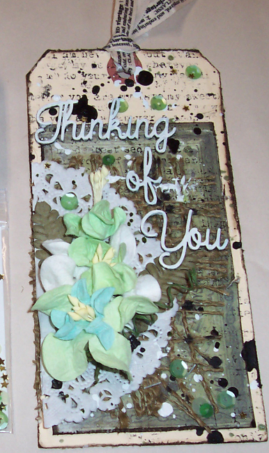
The tag in the middle features the Blue My Top Shimmerz acrylic paint. This time, I blended with white to lighten it a bit:


The one on the right features the other half of the doily, more sequins from the same variety packet, and Chunky Cork Hearts that altered using white acrylic paint and green Staz-on ink, then arranged to look like a shamrock/four-leaf clover:


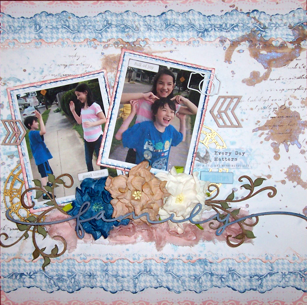
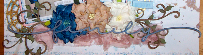
I hope you enjoyed my projects using both CE and SMS products! It was soooo much fun to create with these awesome goodies! Sorry my post is so incredibly photo heavy. I just couldn’t do the intricate, CE designs justice with my pics. They are incredible in real life and I cannot ever get enough of them! They offer a HUGE variety and suit every scrappy style! There’s truly something for everyone and every occasion in her ENORMOUS selection! 😀
____________________________________________________________________________________________________
REMINDER: Please leave a comment at each stop along the hop for YOUR chance to WIN a $25.00 gift card to SpiegelMom Scraps OR a $30 gift certificate to Creative Embellishments!

In case you get lost along the way, here is the complete list of stops along the hop:
SMS Blog www.spiegelmomscraps.com
Creative Embellishments blog- https://creativeembellishments.com/blog/?p=12267
Jody’s Blog: https://spiegelmomscraps.wordpress.com/…
Laura Whitaker blog (March Guest Designer) http://scrappinaroundtheclock.blogspot.com/
Nicolle Kramer’s blog: http://www.nicollelovesscrapbooking.blogspot.com/
Lisa Kingston http://pinkglitterscrapper.blogspot.com/…
Doris Widder’s blog: http://www.distressedscrapper.com <———YOU ARE HERE
Christy Harriman http://www.christysbeautifullife.wordpress.com/… <——YOUR NEXT STOP
Maggi’s blog: http://scraptravelbark.blogspot.com/
Sarah McClellan http://theadventuresofscrappysarah.blogspot.com/…
Sarah’s Blog: http://sarahs-scrapbook.blogspot.ca/…
Hannah Lemieux http://www.scrapbookpagesandcupcakes.com/…
Heather’s Blog: https://heifer21.wordpress.com
Khristina Sorge http://redefinedkreative.blogspot.com/…
Marci’s Blog: http://ascrapfrommarci.blogspot.com/
Evi Cortes http://www.lifewithevi.com/blog
Bev’s Blog: http://beeceecreativity.blogspot.com/
Sara Scraps https://sarascrapsblog.wordpress.com/…
France’s blog: http://fringuetteart.blogspot.com
Rachel Stewart – https://wordsandpaperscraps.wordpress.com/…
Nanné’s blog: http://nannes-creations.blogspot.com
Laura Rumble – http://beadsbuttonsandbirds.blogspot.com/…
Laetitia’s blog : http://triniti59760.blogspot.fr/
Felicia Young – http://rosescrapco.blogspot.com/
Lisa’s blog: http://lisasscrappyhideaway.blogspot.com/
Beth Soler – http://scrappingwonders.com/
Nadine Carlier’s Blog: http://www.myscrapnstuff.com
Crafty Meggy – http://www.craftymeggy.com/blog/
Shona Keehn blog: http://suchawonderfulmess.blogspot.ca/